Kate & I decided we wanted to come up with a new logo, something more fun & cartoony. We felt that we had outgrown "Donnie," & his mustache.
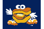
I scoured the internet at the Best Western front desk until I stumbled upon this logo of "Monty," the mascot for the Tampa Bay Rays Double A Team, the Montgomery Biscuits:
I liked the idea of making an actual grilled cheese into a character, with hands, eyes & shoes. So, I used "Monty" as a basis for what would become "Sammy." I sketched out pages of characters over the next weeks before Kate & I arrived at a logo we were ready to digitize.
A friend of ours, Darren did graphic design for his own company, Foxhole Studios & we hired him to make our new logo come to life.
Back & forth we went- him emailing new proofs & us giving notes for minor tweaks. I no longer have any of those early drafts of our logo (we experimented with a lot of different mustaches, sunglasses, sandwich shapes & colors) but, in the end, Darren nailed it.
And now we still have that logo that you see everywhere today:
I guess I can see the resemblance between the two. I think butter is the secret to a successful logo. Photo Credits for Montgomery Biscuits Logos: Chris Creamer, SportLogos.net


No comments:
Post a Comment
Please Leave Comments Below: